
SpliceSeq
| Overview | |
|---|---|
| Description | A tool for investigating alternative mRNA splicing in next generation mRNA sequence data |
| Development Information | |
| Language | Java |
| Current version | 2.1 |
| Platforms | Platform independent |
| License | Freely available for academic and commercial use |
| Status | Active |
| Last updated | February 21, 2014 |
| References | |
| Citation | Ryan, M. C., Cleland, J., Kim, R.G., Wong, W. C., Weinstein, J. N., SpliceSeq: a resource for analysis and visualization of RNA-Seq data on alternative splicing and its functional impacts, Bioinformatics 28 (18) p.2385 (2012). https://doi.org/10.1093/bioinformatics/bts452 (opens in new tab) |
| Help and Support | |
| Contact | MDACC-Bioinfo-IT-Admin@mdanderson.org |
Sample Comparison View
The Sample Comparison View is used to study differential splicing patterns between two samples. To use this view, the comparison must have already been generated in the database. (See Loading Data for information on creating sample comparisons.)
To get to this view, first select Sample Comparison View in the View Combobox in the Data Selection Bar. Next, select the comparison that you wish to investigate using the DataSet Combobox also in the Data Selection Bar.
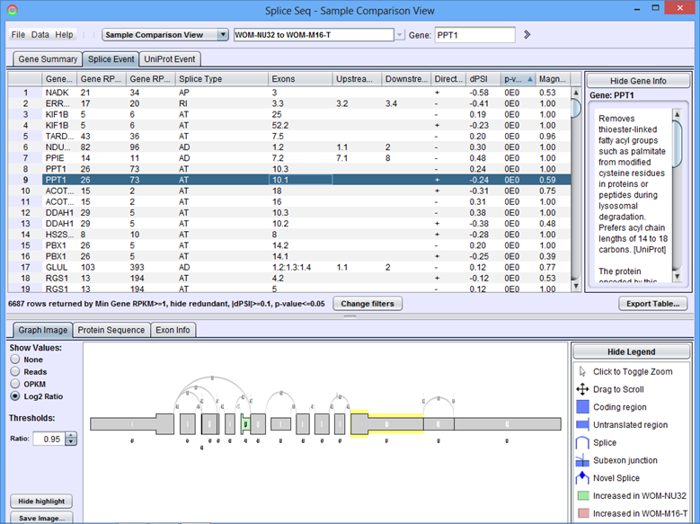
When the comparison loads, the Results Panel will be loaded with all the splice events identified in the chosen comparison.
Sample Comparison View Results Panel
Gene Summary Tab of the Results Panel allows you to sort, filter, display, and export the results for each gene in the currently selected comparison.
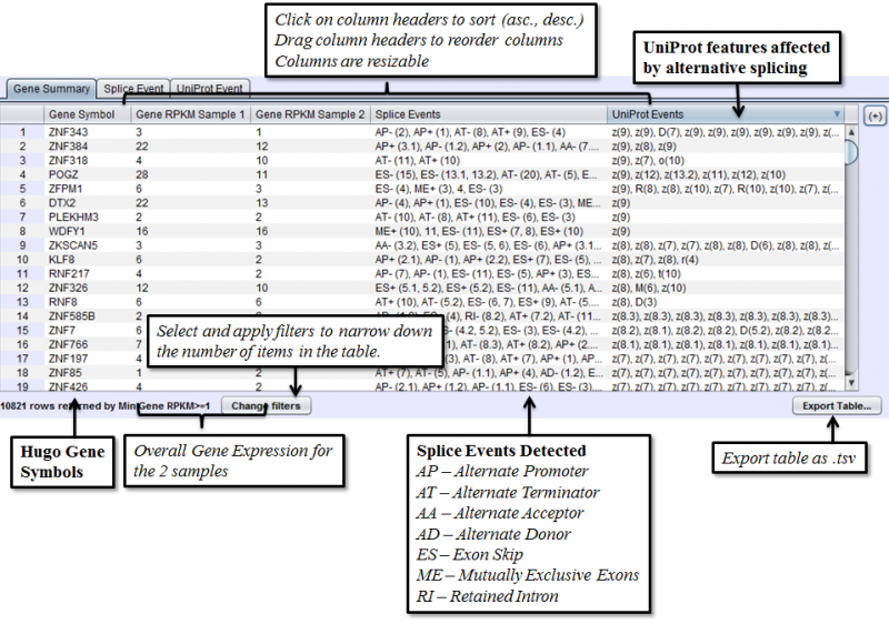
The columns that require further explanations are::
- Gene RPKM Sample 1 - overall Gene Expression level of the first sample.
- Gene RPKM Sample 2 - overall Gene Expression level of the second sample. (Click here for more information about RPKM)
- Splice Events - Categorized list of the differential splice events detected. For example, ES(4) indicates and exon skip on exon number 4 that occurs more frequently in one sample. Use the Splice Event Filter drop down list to see the description and codes for each event type.
- UniProt Event - Categorized list of UniProt annotated regions that are affected by alternate splicing differences between the samples. For example, B(9) indicates a Bind Site on exon 9 that is excluded more frequently in one sample’s isoforms. See the legend in the Protein Sequence Tab of the Gene Panel for a full list of UniProt annotation categories.
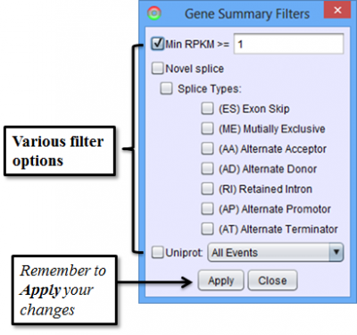
To access filtering functions for the table, use the Change filters button. The following filters are available:
Splice Event Tab in the Results Panel will contain a row for every splice event detected.
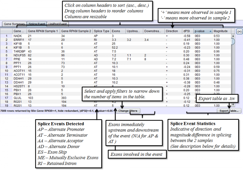
Columns that require additional explanation:
- dPSI - Delta Percent-Spliced-In. The PSI of the second sample minus that of the first sample.
- p-value: Calculating on a 2x2 Contingency table, using Fisher’s exact test. Chi-Square approximation is used for larger numbers.
- Magnitude - The proportion of isoforms which the splice event affects
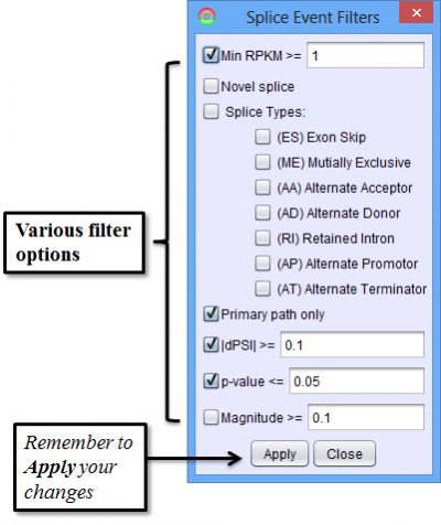
To access filtering functions for the table, use the Change filters button. The following filters are available:
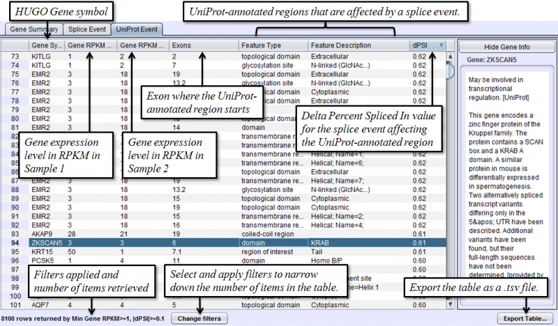
Uniprot Event Tab in the Results Panel will contain a row for every UniProt annotated feature that is affected by alternative splicing.
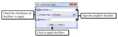
To access filtering functions for the table, use the Change filters button. The following filters are available:
Sample Comparison View Detail Panel
Graph Image Tab of the Detail Panel shows how the RNASeq reads of two different samples compare with each other when aligned onto the same splice graph. Comparison of splicing patterns between samples is complicated by the fact that the expression levels of a gene can vary widely without indicating a difference in splicing. To adjust for that, splice events are detected from changes in the percent spliced in (PSI) values and can be visualized in the graphs using a ratio that is normalized to the gene expression level prior to cross-sample comparison. (See Methods)
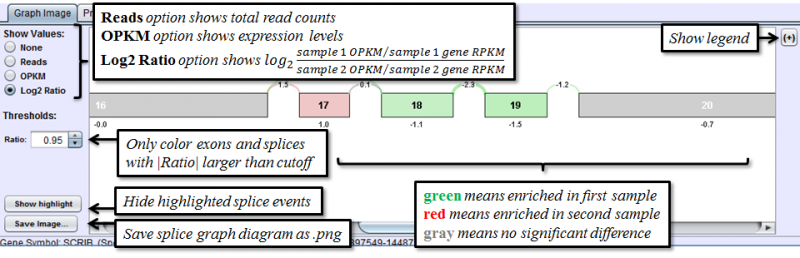
Portions of the graph drawn in gray indicate that the exon/splice is expressed at equivalent proportions in both samples. Splices or exons drawn in red are expressed at a higher proportional level in the second sample; those drawn in green are expressed at higher proportions in the first sample.
The Show Values radio buttons on the left toggles the display of numerical values for every exon and splice. There are 4 options:
- None - No numerical values are displayed
- Reads - Total reads overlapping each exon / splice
- OPKM - Observations Per Kilobase per Million reads. OPKM is the total number of reads overlapping each exon / splice normalized for length and total number of aligned reads in the sample. The length used is the window size in which a read may overlap the exon / splice. This normalization allows for cross exon or cross sample comparisons.
- Log2 Ratio: The log2 value of the ratio of normalized sample 1 OPKM over normalized sample 2 OPKM. This value represents the magnitude of difference between the samples after correcting for any differences in gene expression levels. Positive number indicates enrichment in sample 1, negative number indicates more enrichment in sample 2.
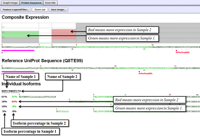
Protein Sequence Tab of the Detail Panel shows the protein sequence, functional annotation, and relative expression level of the isoforms inferred from splice patterns of the gene from a pair of samples. For basic information on this tab, refer to Protein Sequence Tab.
The below example shows that a nucleotide phosphate binding site on exon 1 is expressed more in Sample 1 than in Sample 2 and dramatic increase in the percentage of the isoform that starts at exon 8, from 18% in Sample 1 to 69% in Sample 2.
Exon Info Tab of the Detail Panel shows the location, properties and nucleotide sequences of each exon in the gene model. More information can be found in the GUI Overview section.