SpliceSeq
| Overview | |
| Description | A tool for investigating alternative mRNA splicing in next generation mRNA sequence data |
| Development Information | |
| Language | Java |
| Current version | 2.1 |
| Platforms | Platform independent |
| License | Freely available for academic and commercial use |
| Status | Active |
| Last updated | February 21, 2014 |
| References | |
| Citation | Ryan, M. C., Cleland, J., Kim, R.G., Wong, W. C., Weinstein, J. N., SpliceSeq: a resource for analysis and visualization of RNA-Seq data on alternative splicing and its functional impacts, Bioinformatics 28 (18) p.2385 (2012). https://doi.org/10.1093/bioinformatics/bts452 |
| Help and Support | |
| Contact | MDACC-Bioinfo-IT-Admin@mdanderson.org |
Group Comparison View
The Group Comparison View is used to study differential splicing patterns between two groups of samples on average. To use this view, the group comparison must have already been loaded into the database. (See Loading Data for information on creating groups comparisons.)
The Group Comparison View is identical in function to the Sample Comparison View. The only difference between the two is that instead of presenting comparison data for two samples, the Group Comparison View presents the differences between two groups of samples. The Log 2 Ratio value presented in the group view presents a ratio indicating the log2 difference in expression of an exon or splice between the two groups. Each value is corrected for gene expression level so the ratio indicates splicing differences above and beyond any difference in expression between the groups. A Log 2 Ratio of 1.0 would indicate a twofold difference in inclusion (positive) or exclusion (negative) in group 1 vs. group 2. P-values presented in this view are the result of a t-test conducted on the normalized exon or splice expression in both groups.
To get to this view, first select Group Comparison View in the View Combobox in the Data Selection Bar. Next, select the group comparison that you wish to investigate using the DataSet Combobox also in the Data Selection Bar.
When the group comparison loads, the Results Panel will be loaded with all the splice events identified in the chosen group comparison.
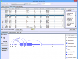
Group Comparison View Results Panel
Gene Summary Tab of the Results Panel allows you to sort, filter, display, and export the results for each gene in the currently selected group comparison.
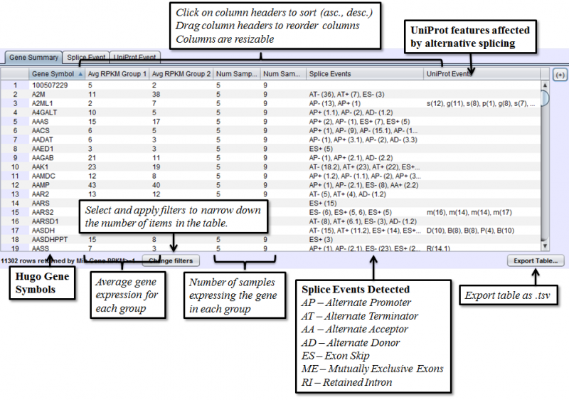
The columns that require further explanations are::
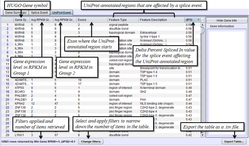
- Avg RPKM Group 1 - overall Gene Expression level of the first group on average.
- Avg RPKM Group 2 - overall Gene Expression level of the second group on average.
- Num Samples Group 1 - number of samples expressing a given gene in group 1
- Num Samples Group 2 - number of samples expressing a given gene in group 2
- Splice Events - Categorized list of the differential splice events detected. For example, ES(4) indicates and exon skip on exon number 4 that occurs more frequently in one sample. Use the Splice Event Filter drop down list to see the description and codes for each event type.
- UniProt Event - Categorized list of UniProt annotated regions that are affected by alternate splicing differences between the samples. For example, B(9) indicates a Bind Site on exon 9 that is excluded more frequently in one sample’s isoforms. See the legend in the Protein Sequence Tab of the Gene Panel for a full list of UniProt annotation categories.
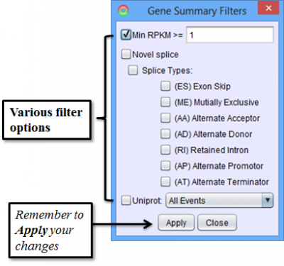
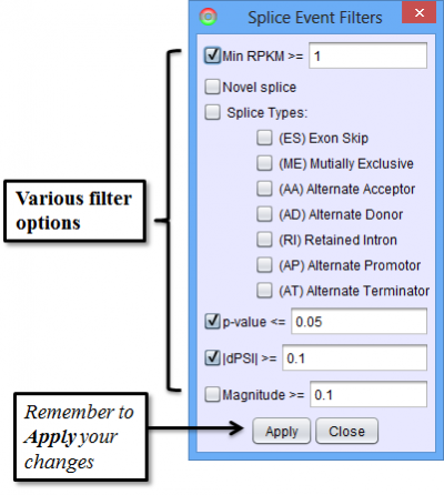
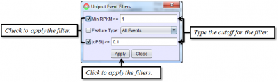
To access filtering functions for the table, use the Change filters button. The following filters are available:
Splice Event Tab in the Results Panel will contain a row for every splice event detected.
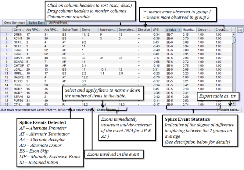
Columns that require additional explanation:
- dPSI - Delta Percent-Spliced-In. The average PSI of the second group minus that of the first group.
- p-value: Calculated with t-test of unequal variance, using the PSI average and variance of each group.
- Magnitude - The proportion of isoforms which the splice event affects
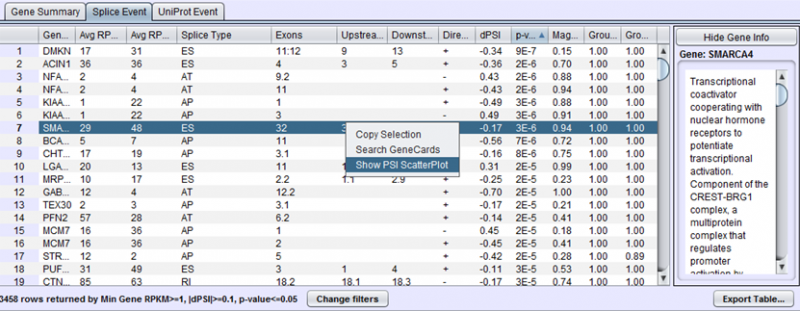
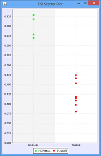
To view the scatter plot of individual sample PSIs within the group, right click on a row in the Splice Event table and choose Show PSI Scatterplot.
To access filtering functions for the table, use the Change filters button. The following filters are available:
Uniprot Event Tab in the Results Panel will contain a row for every UniProt annotated feature that is affected by alternative splicing.
To access filtering functions for the table, use the Change filters button. The following filters are available:
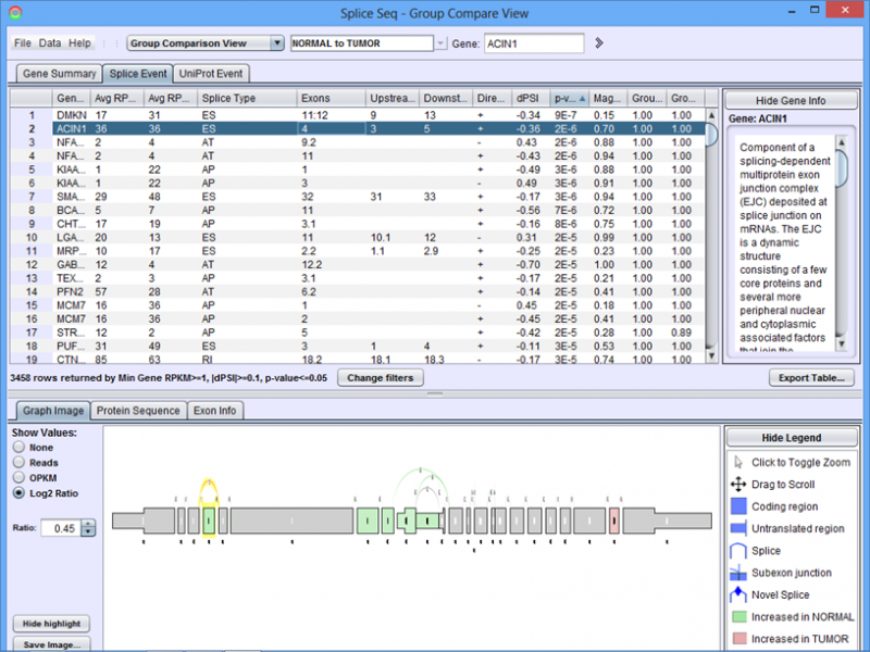
Group Comparison View Detail Panel
Graph Image Tab of the Detail Panel shows how the RNASeq reads of group of samples align onto the same splice graph on average.
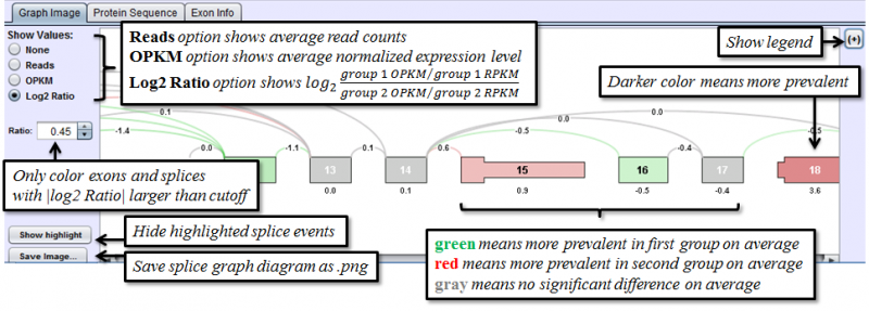
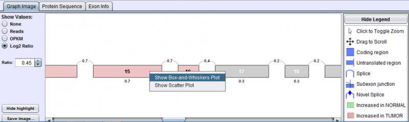
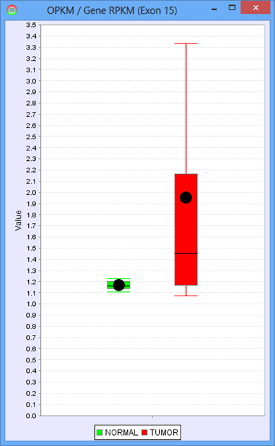
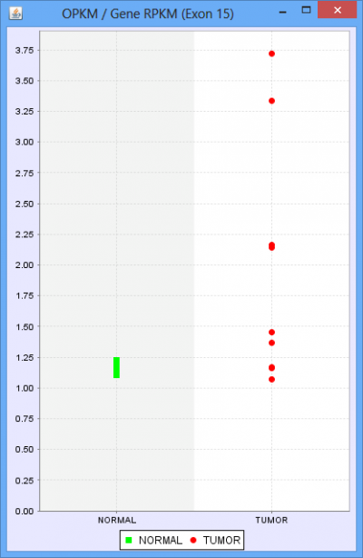
The only additional feature provided in the Group Comparison View is the ability to investigate the distribution of values for any exon or splice. Select log2 ratio, OPKM, or Total Reads and then right click on an exon or splice line. This will pop-up a menu and you will be able to select either a scatter plot or box-and-whiskers plot representing the sample values for the groups. These plots are helpful in determining how robust differences are among members of the groups (as opposed to an outlier driven difference in mean). Selecting Log2 Ratio and then asking for a plot will present the ratio for each sample of the exon expression (or splice expression) divided by the overall gene expression value. This is often a good way to explore the splicing differences between the groups as each sample value is corrected for variation in gene expression level.
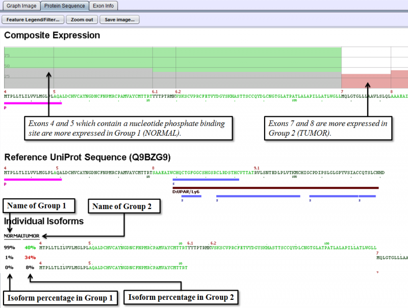
Protein Sequence Tab of the Detail Panel shows the protein sequence, functional annotation, and relative expression level of the isoforms inferred from splice patterns of the gene from a pair of samples. For basic information on this tab, refer to Protein Sequence Tab.
The below example shows that a nucleotide phosphate binding site on exons 4 and 5 is expressed more in Group 1 (normal sample group) than in Group 2 (tumor sample group).
Exon Info Tab of the Detail Panel shows the location, properties and nucleotide sequences of each exon in the gene model. More information can be found in the GUI Overview section.